06.24.2021
Tuesday Night Project started over two decades ago with our flagship program, Tuesday Night Cafe. Now in our twenty second year, we present a range of programs including Tea and Letter Writing and TN Labs. Today, we’re excited to share a new visual identity that reflects our community and ever-growing work!

Over the years, we’ve had a number of wonderful identity marks designed by TNP staff, most recently Byron Dote and Candace Kita. This new mark, designed by TN family member Yosuke Murakami, plays on the DIY-spirit of their work while looking toward the future with new opportunities for textures and colors.
We went through an internal process that allowed us to explore our identity. We were drawn to organic forms, layered textures, and connected shapes -- all of which draw on our values as an organization.
Murakami remarks, “My approach to designing this logo was about leaning into the story TNP was trying to tell. There are so many layers, textures, and movement of the lines that go into the depth of the stories that TNP has, and I wanted to capture that in this logo.” We love how he was able to intertwine symbols and textures to represent the intersectionality of our work and how flexible the logo could be for future programs.
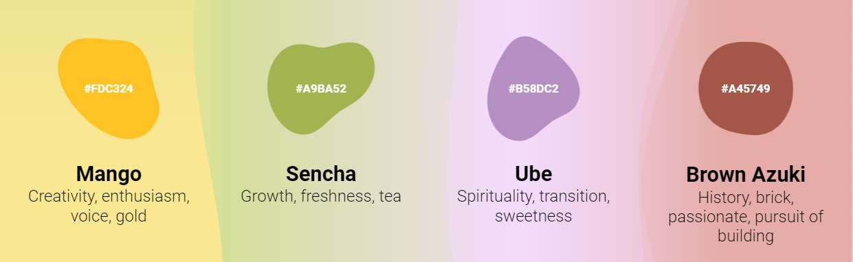
We thought about the types of relationships we’ve built with our community, identified icons within our spaces, and used our mission to create a meaningful and accurate representation of our organization. We felt that this variety of colors could more accurately represent our diverse programming moving forward.
Ultimately, we aim to be the same organization rooted in art+community but with an updated style. Keep checking for our new logo, these new colors, and more in the coming months!